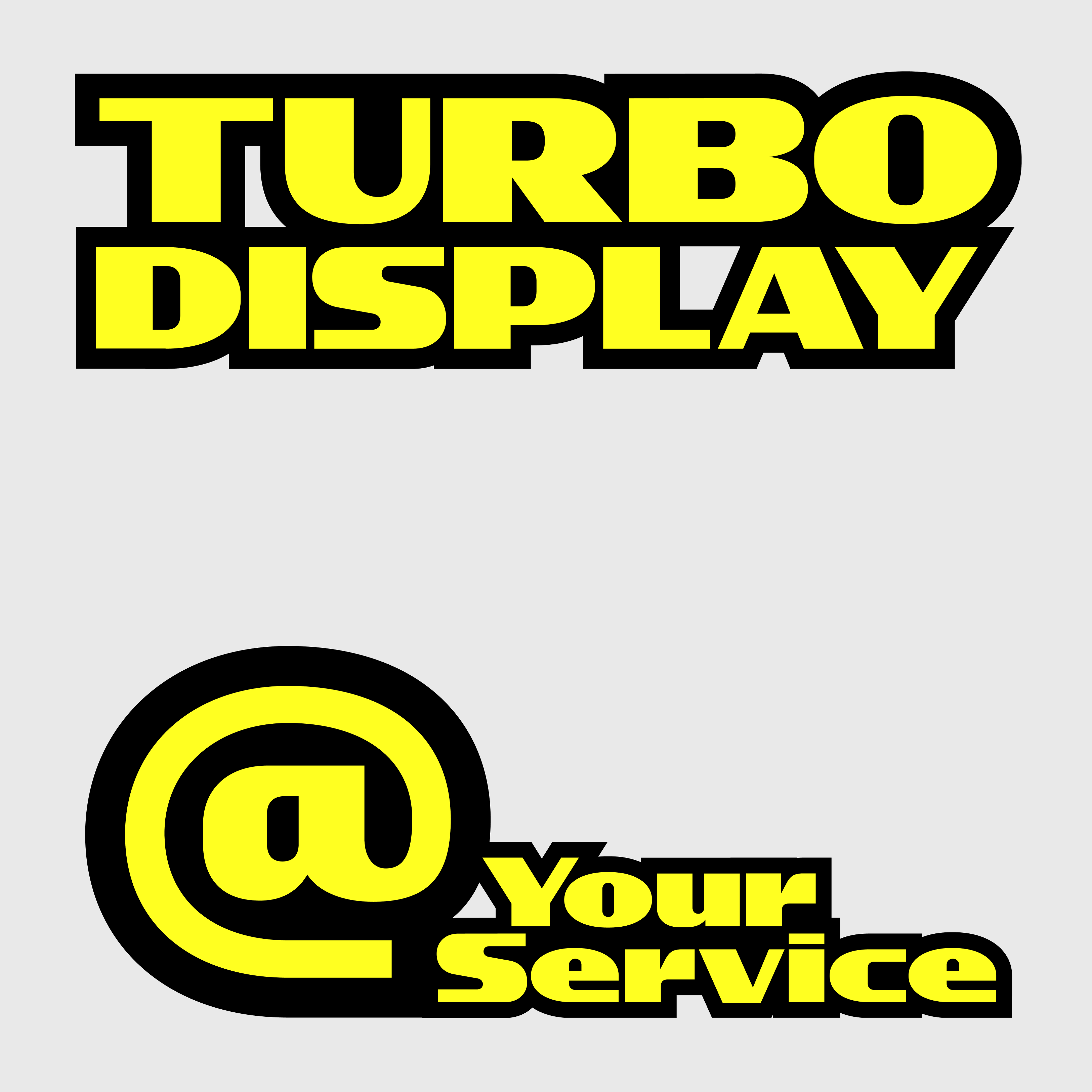
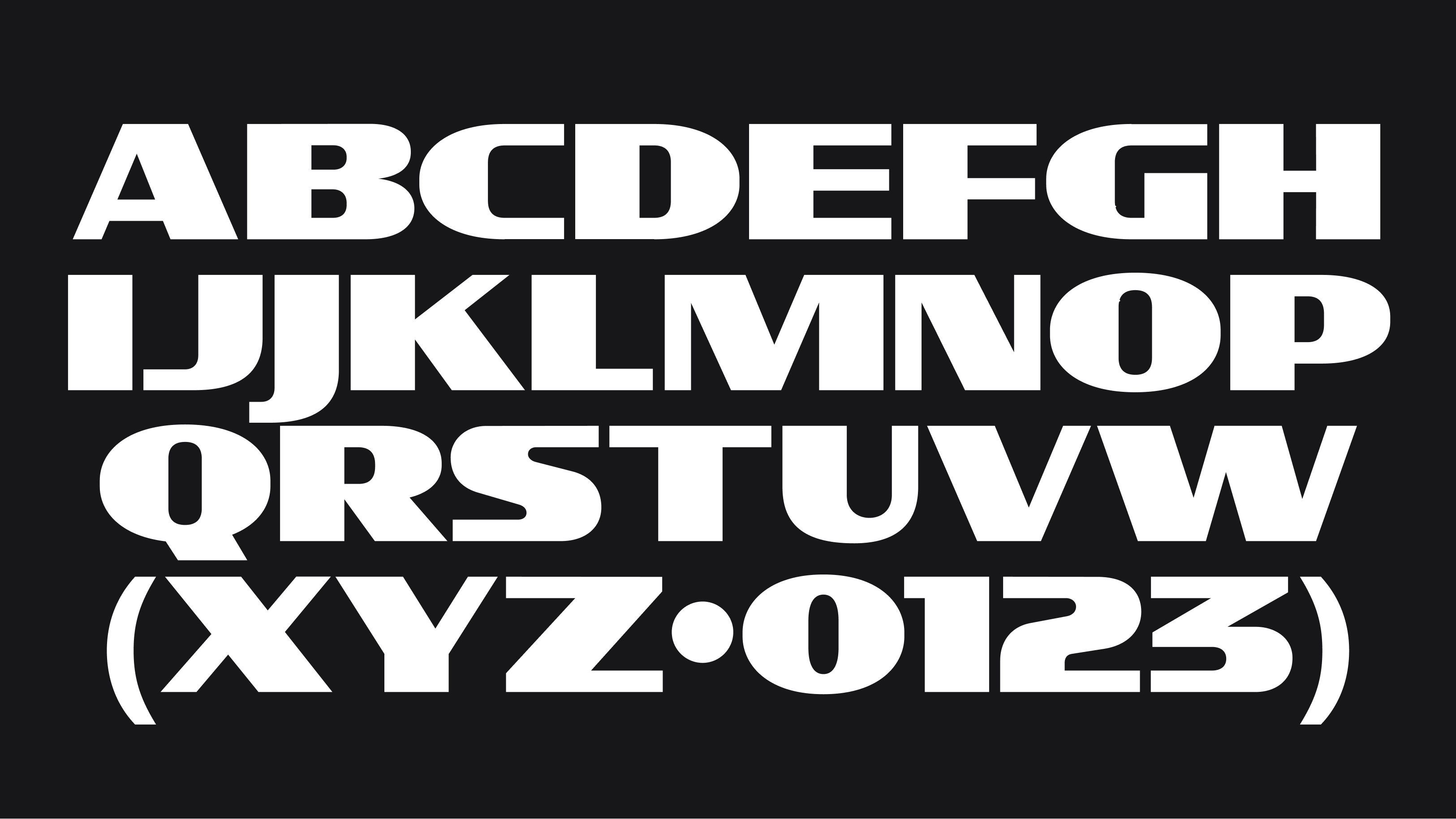
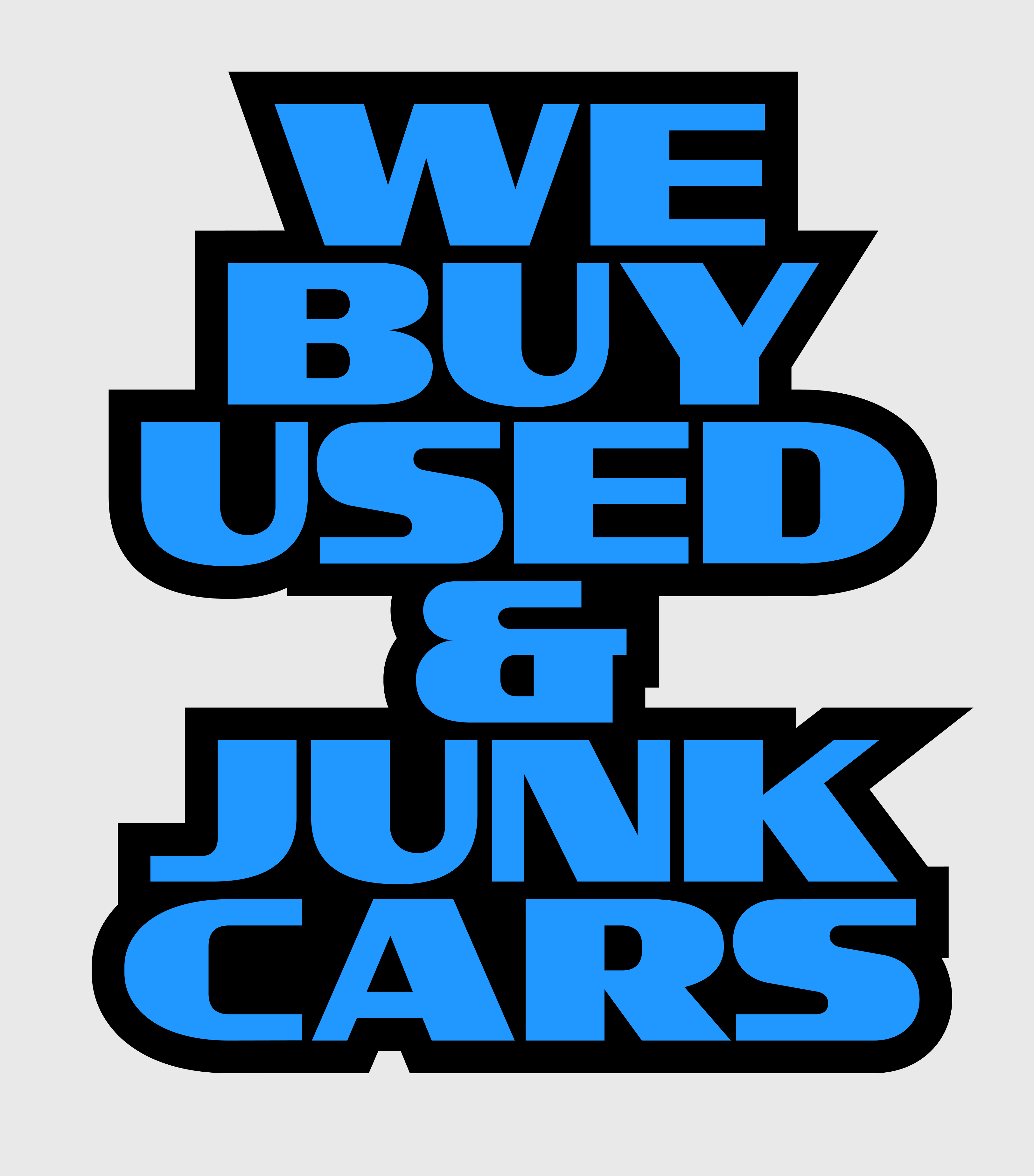
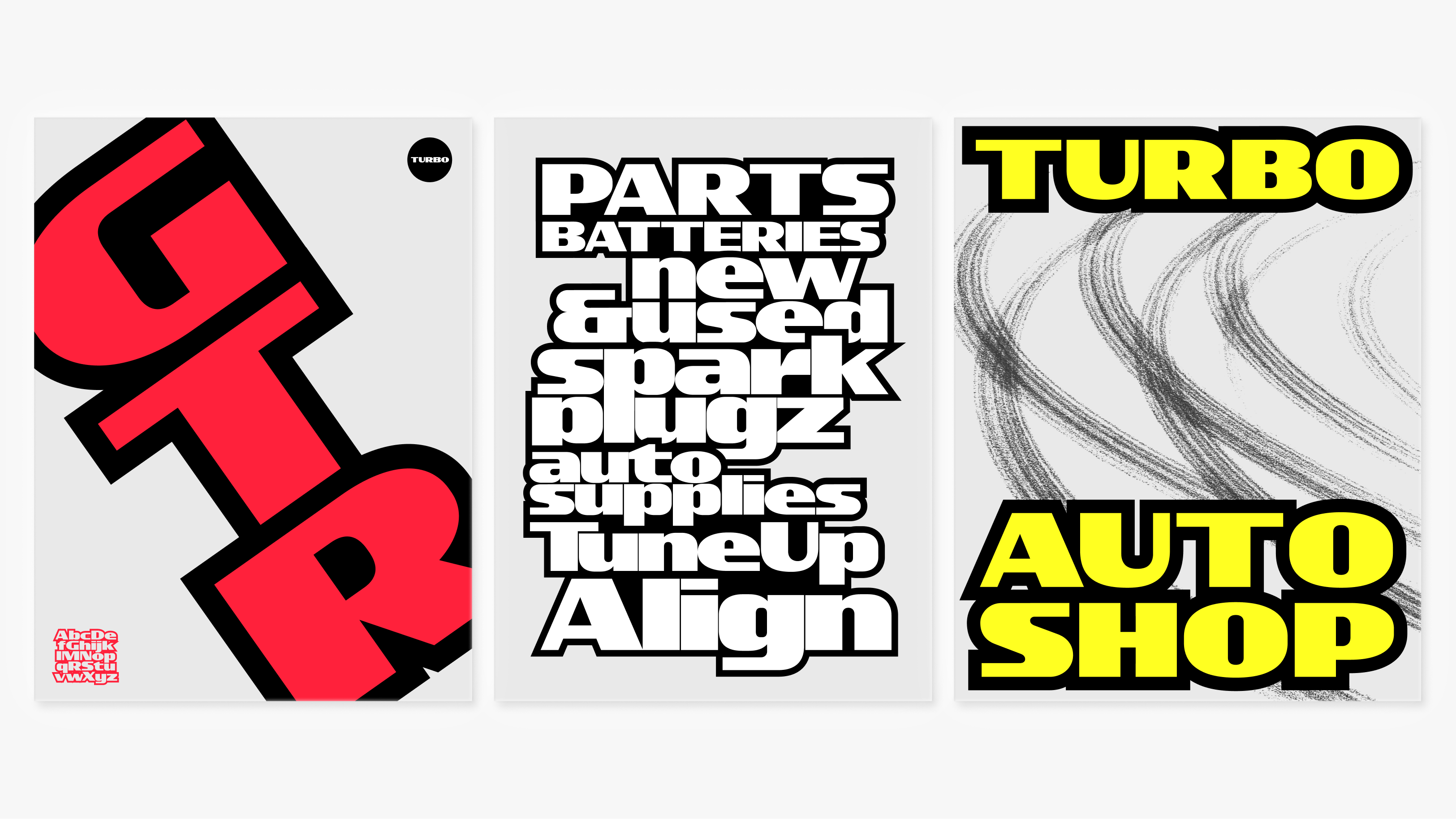
Taking inspiration from hand painted signs found in mechanic and auto shops littered around Los Angeles. Turbo Display makes design decisions based on what a sign painter might be thinking while painting during a hot sunny day. Considering high visibility for all the drivers that pass by shops at break-neck speeds, Turbo was designed heavy and wide. Simple, geometric letter construction and an interrupted translation design with little brush rotation so that sign painters wouldn’t have to sweat too much on an intricate design. The letter “S” really captures the design decisions that carry the rest of the typeface. Simple, fast, and highly visible.
Learn more about this project at: Display Type Design